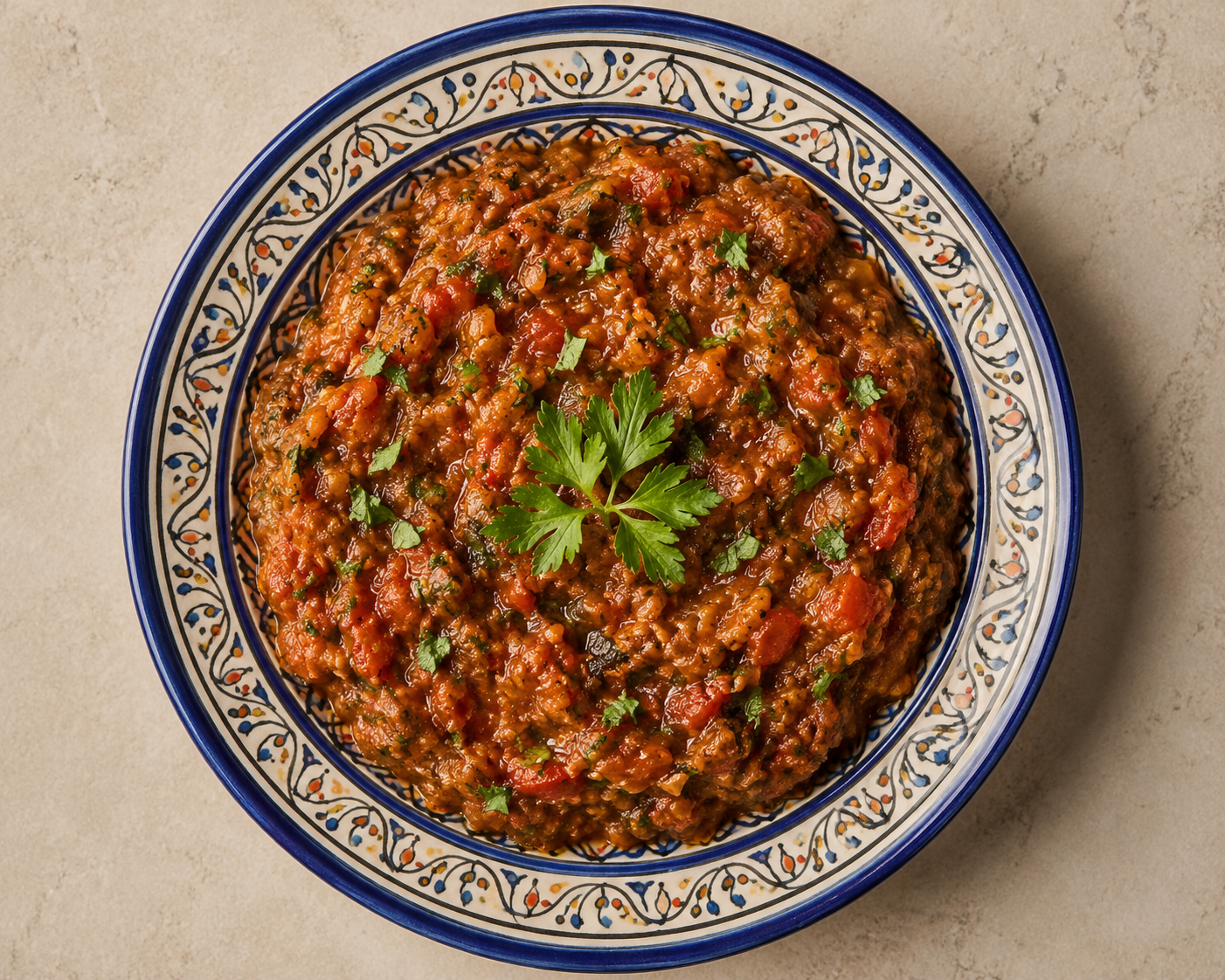
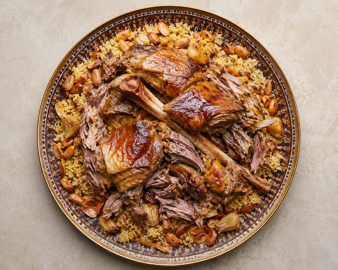
Royal Lamb Tagine
Slow-braised lamb, apricot & almonds
AED 68
This interactive brand presentation — with its scroll-scrub reveal and fine detail — is crafted for desktops, laptops, tablets and interactive displays. Please open it on one of those; it is not available on mobile phones. يرجى فتحه على حاسوب مكتبي أو محمول أو جهاز لوحي أو شاشة تفاعلية — العرض غير متاح على الهاتف المحمول.
In Morocco a dar is not just a building. It is the courtyard house — the riad — where the family gathers, the table is always long, and the door is always open.
Choosing “Dar” instead of “restaurant” repositions the entire brand: guests are not customers, they are invited into a home. This single word drives the ornamental frame of the logo — an architectural doorway that shelters everything inside it.

Albahja means joy — and for centuries it has been the beloved nickname of Marrakech itself: Madinat al-Bahja, the City of Joy.
The name is therefore a double signature: it promises an emotion and names the city of origin in the same breath. That is why “MARRAKECH” sits inside the lockup in saffron gold — not as an address, but as a birthplace. مدينة البهجة — مراكش

“From the rich culture of Morocco to your table — Dar Albahja is more than a name, it's an experience.”
This is the sentence written in pencil at the bottom of our very first sketch board, and it survived every round of refinement untouched. Everything you are about to see — frame, tagine, steam, calligraphy, color — exists to keep this promise. من ثقافة المغرب الغنية إلى مائدتكم

Positioning: a premium yet welcoming Moroccan dining brand — corporate enough for franchising, soulful enough to feel hand-made.
The doorways of the medina — horseshoe and ogee arches that have framed Moroccan welcomes for a thousand years. We drew them first because the logo needed a threshold: a shape that says enter, you are expected.

Hand-cut tile mosaics whose eight-point khatam stars repeat to infinity — harmony and balance made mathematical. This is the grammar behind every star motif and lattice band you will find inside the mark.

Scrolling vines and leaves — nature formalized into ornament, the symbol of growth and prosperity. In the final logo the arabesque becomes a living wreath in Medina Green, wrapping the emblem the way gardens wrap a riad courtyard.

Morocco's most beloved vessel — the conical clay pot that slow-cooks generosity itself. Of every symbol we studied, only the tagine says food, gathering and heritage in a single silhouette. It earned the center of the logo.

Before a single vector was drawn, the whole identity was worked out in pencil: inspiration studies, core elements, the color story and the design evolution — all on this presentation board. The next pages walk through it piece by piece.
Click the board to inspect it at full size. اضغط على اللوحة لتكبيرها
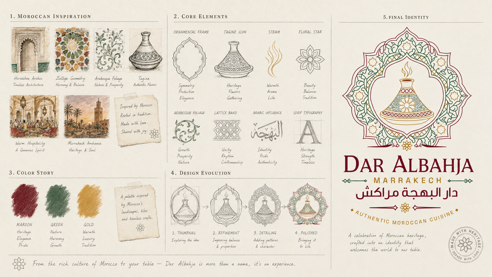
Before composition, each ingredient of the mark was drawn on its own — so every line would later earn its place. These eight studies became the visual vocabulary of the whole identity.

Three pigment swatches scrubbed straight onto the board: maroon for heritage, elegance and pride · green for nature, harmony and growth · gold for warmth, luxury and tradition.
The pencil note beside them reads: “a palette inspired by Morocco's landscapes, tiles and timeless crafts.” The digital palette in Part V is simply this page, measured. لوحة ألوان من مناظر المغرب وبلاطه وحرفه الخالدة

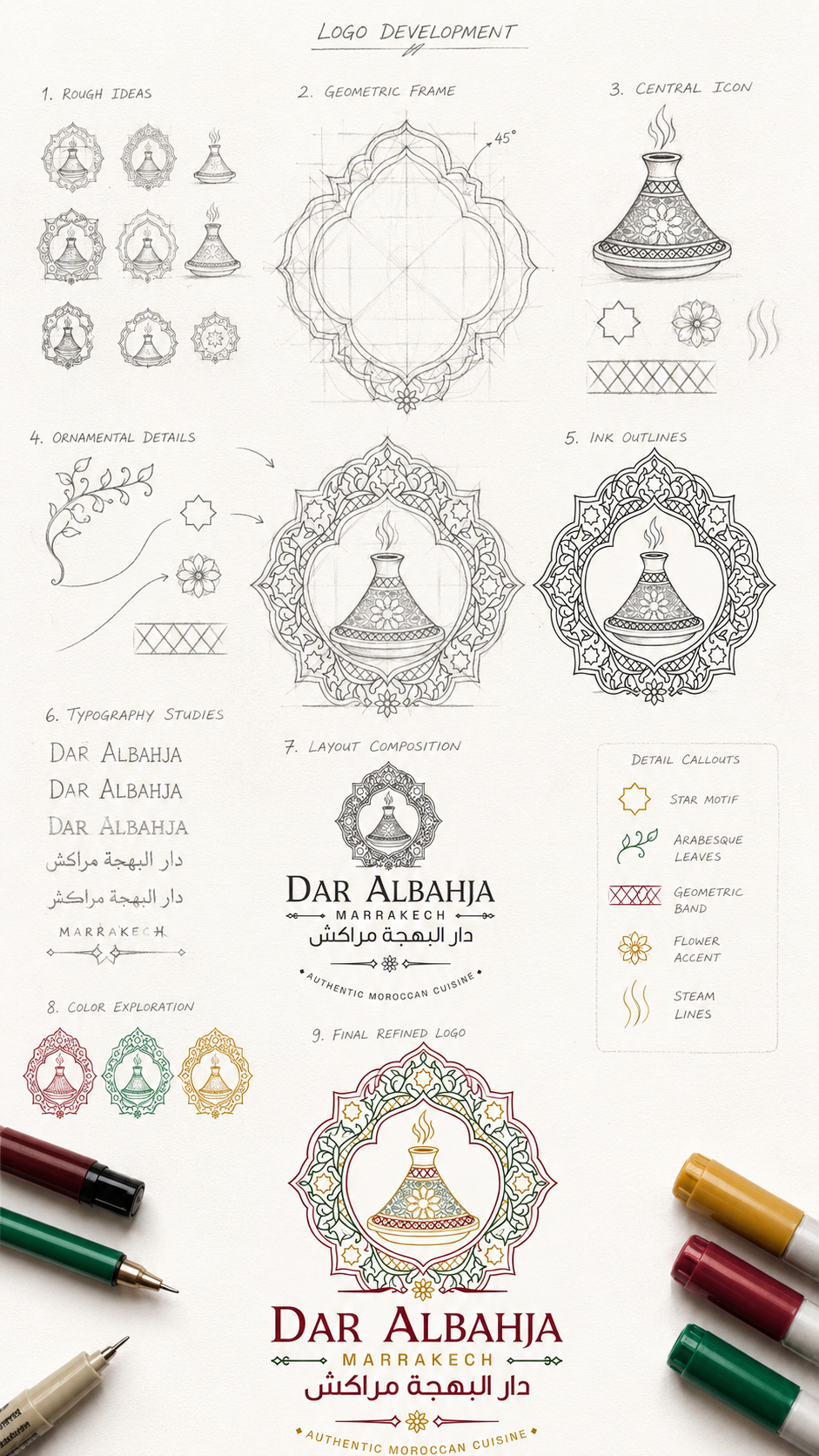
Rough ideas → geometric frame → central icon → ornamental details → ink outlines → typography studies → layout composition → color exploration → the final refined logo. Nothing skipped, nothing improvised.
The next four pages zoom into this sheet stage by stage, so you can follow exactly how the pencil became the mark. الصفحات التالية تكبّر كل مرحلة على حدة
Nine thumbnails tested different frames, tagine silhouettes and steam gestures. One composition earned refinement — and its frame was then rebuilt properly: an ogee outline constructed on 45° guides, so the “hand-drawn” emblem is secretly precise.

The tagine was drawn as a patterned ceramic, not a flat pictogram — florals on the cone, a diamond band on the lid. Around it, the supporting cast was detailed by hand: star motifs, flower accents, scrolling leaves and the lattice band.

A clean ink pass committed the composition. Then the name was tested letter by letter: three serif candidates for “Dar Albahja”, two naskh weights for دار البهجة مراكش — until both scripts balanced on the same baseline of dignity.

The lockup was composed — emblem above, serif name, gold MARRAKECH, Arabic beneath, tagline seal below. Three single-ink versions tested maroon, green and gold separately… then the final refined logo united all three. That mark is waiting for you in the next chapter — you will assemble it yourself. ستركّبون الشعار بأنفسكم في الفصل القادم

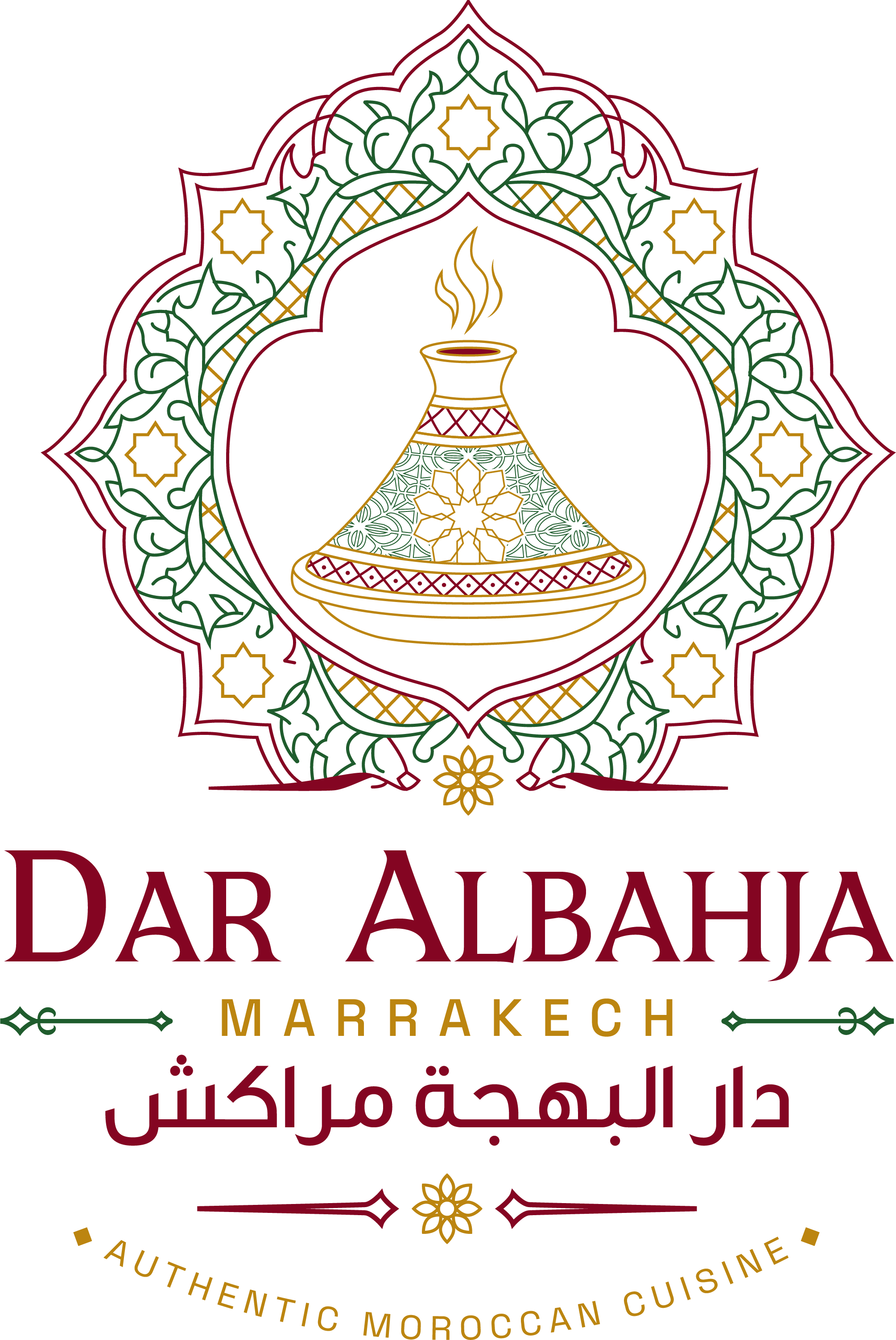
Every element you just merged is present and accounted for: the ogee doorway shelters the patterned tagine; golden steam rises through the arch; khatam stars and the arabesque wreath orbit in zellige rhythm; and the bilingual name anchors it all above the tagline seal.
Nothing here is decoration. Everything is meaning.
Three hand-drawn curls of golden steam crown the mark — the universal promise of food served hot, alive and generous. It is the brand saying: the kitchen never sleeps.
The ogee frame is constructed on 45° guides with mirrored quadrants; the tagine sits on the exact vertical axis; the stars are placed on radial divisions of the wreath circle. This is why the emblem stays crisp from a wax seal to a five-metre facade.

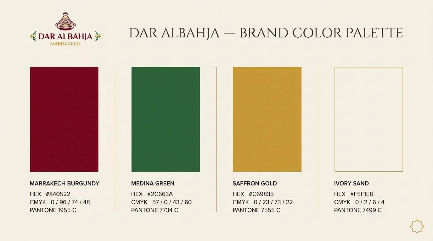
The pencil pigments of Part III, measured into print-ready law: every color specified in HEX for screens, CMYK for print, and PANTONE for fabric, ceramic and signage — so the burgundy on a menu matches the burgundy on a uniform apron, forever.
In the lockup, the naskh line sits directly beneath the serif line at a matched optical weight — two scripts, one dignity, neither subordinate to the other. حرفان بكرامة واحدة
Use on Ivory Sand, white paper, bright walls and daylight photography. Full color always; never place the light version on dark or busy grounds. للاستخدام على الخلفيات الفاتحة فقط
Two night voices: an ivory-and-gold engraving for windows, menus and wax seals — and a full-color jewel for illuminated signage and evening interiors. للاستخدام على الخلفيات الداكنة
Vertical for facades and covers · compact for stamps, avatars and app icons · extended for letterheads and website headers. لكل استخدام تكوينه الصحيح
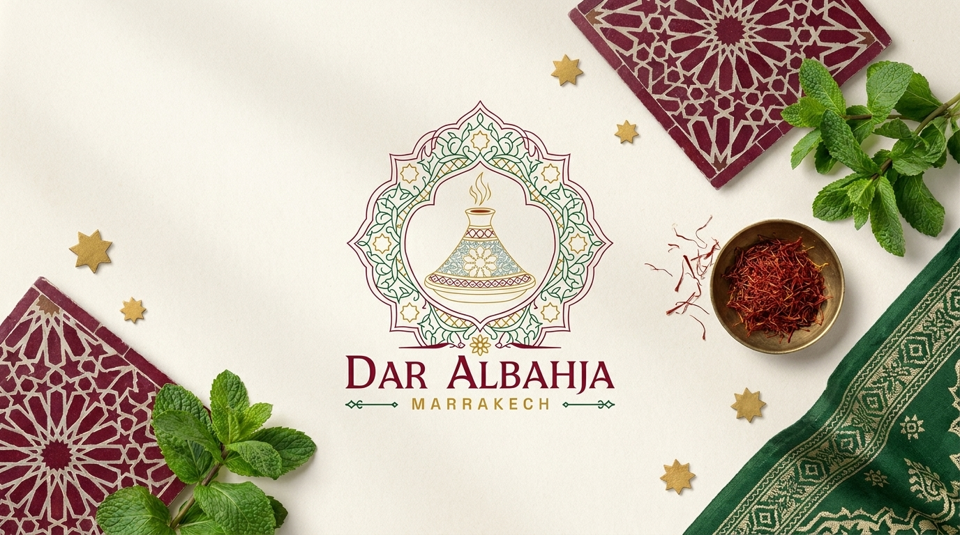
The identity photographed in its raw materials — carved tile, fresh mint, a brass bowl of saffron threads. This is the brand's tabletop truth: real craft, real ingredients.
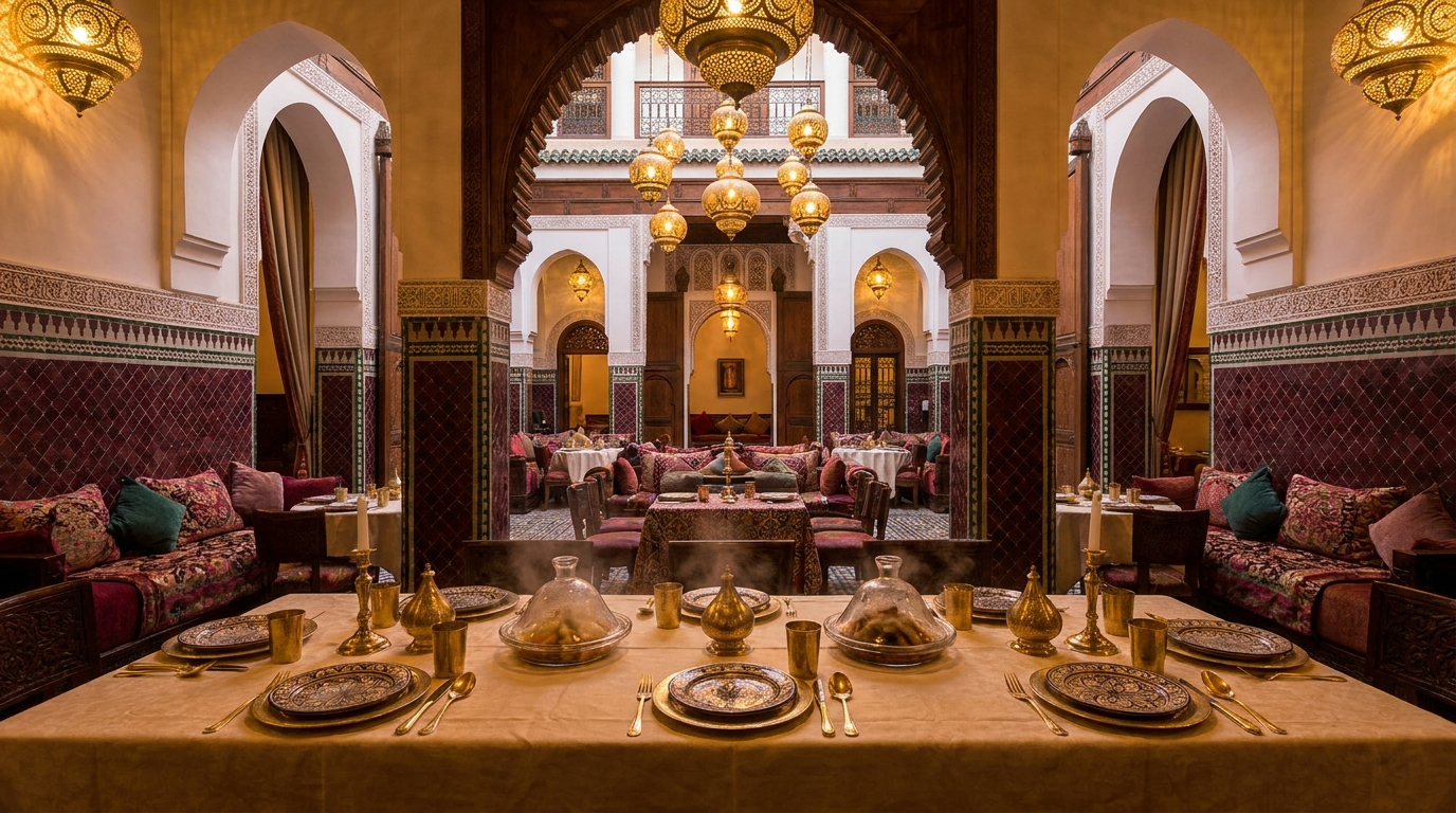
Brass lanterns, horseshoe arches, velvet banquettes — the architectural warmth the interior design will inherit. The logo's ogee frame lives here in full scale.
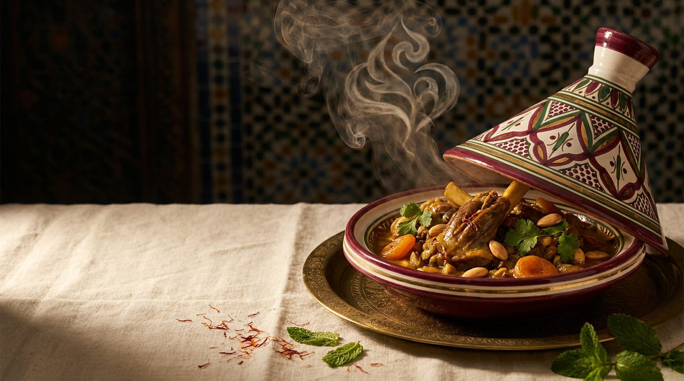
The painted tagine, lid lifted, steam curling exactly as the logo draws it. Photography direction: warm side-light, patterned ceramic, saffron threads scattered on linen.
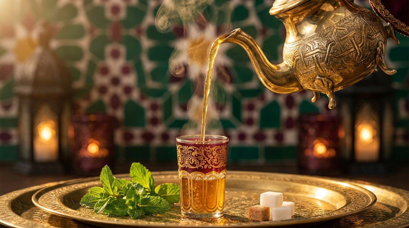
Mint tea poured high from engraved brass — Morocco's signature of welcome. Every Dar Albahja meal ends with this gesture; the brand's gold was measured against this light.
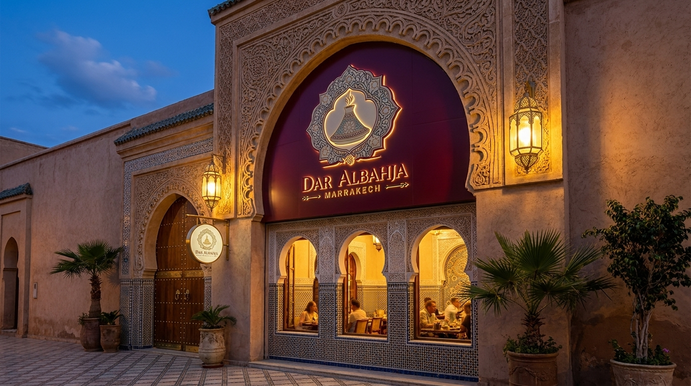 ⌕ ENLARGE
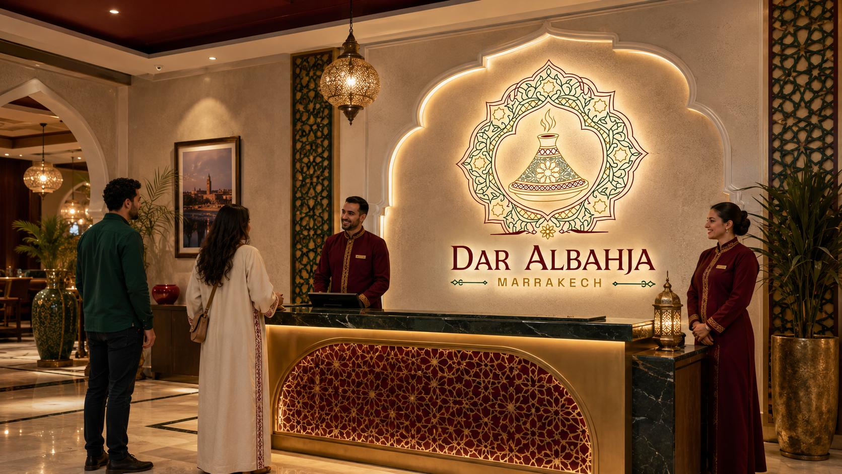 ⌕ ENLARGE
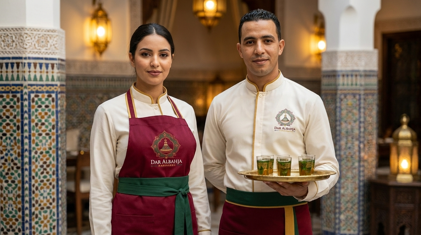 ⌕ ENLARGE
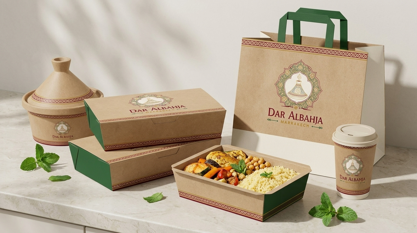 ⌕ ENLARGE
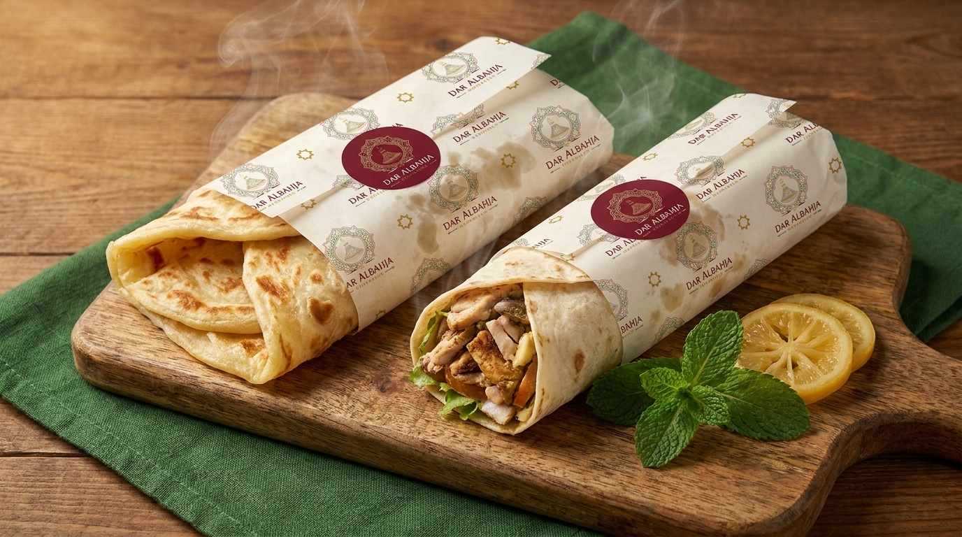 ⌕ ENLARGE
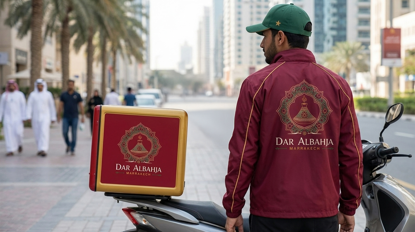 ⌕ ENLARGE
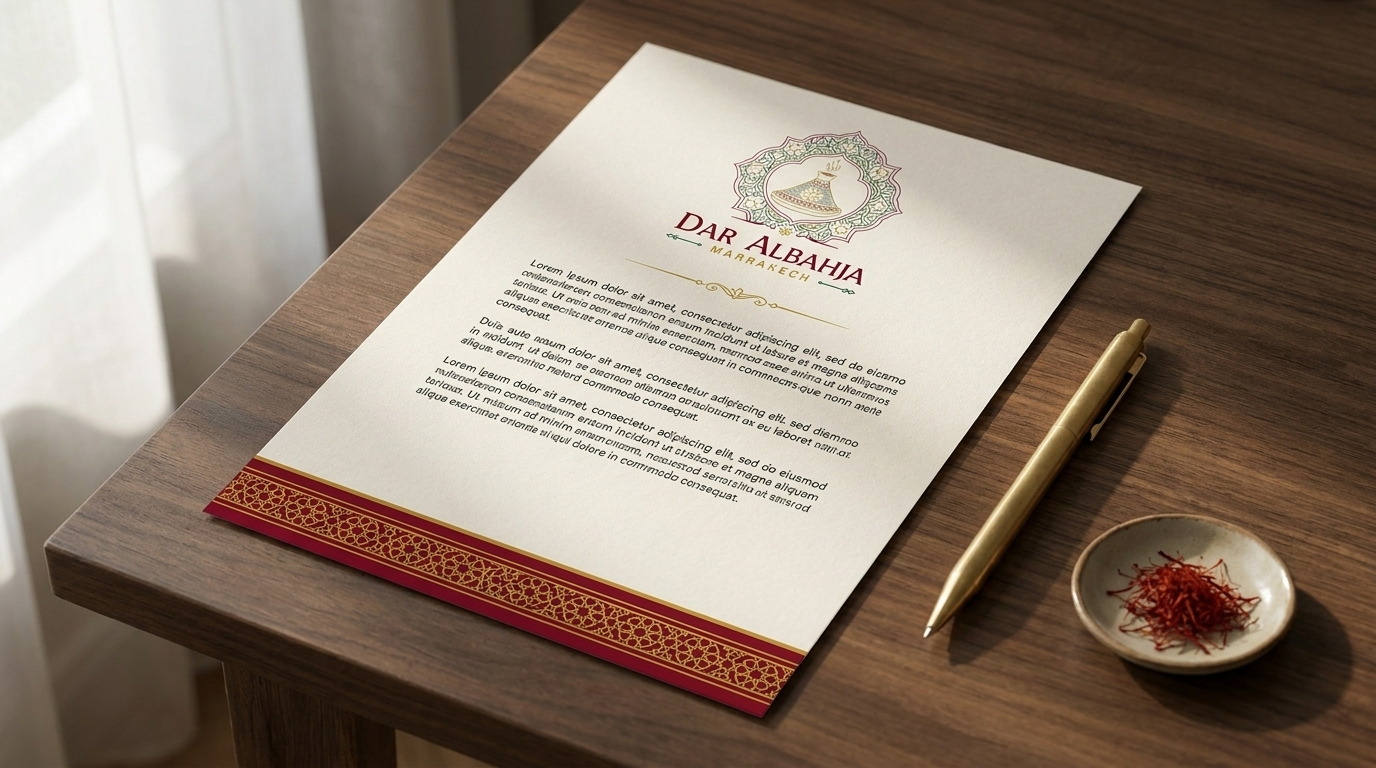 ⌕ ENLARGE
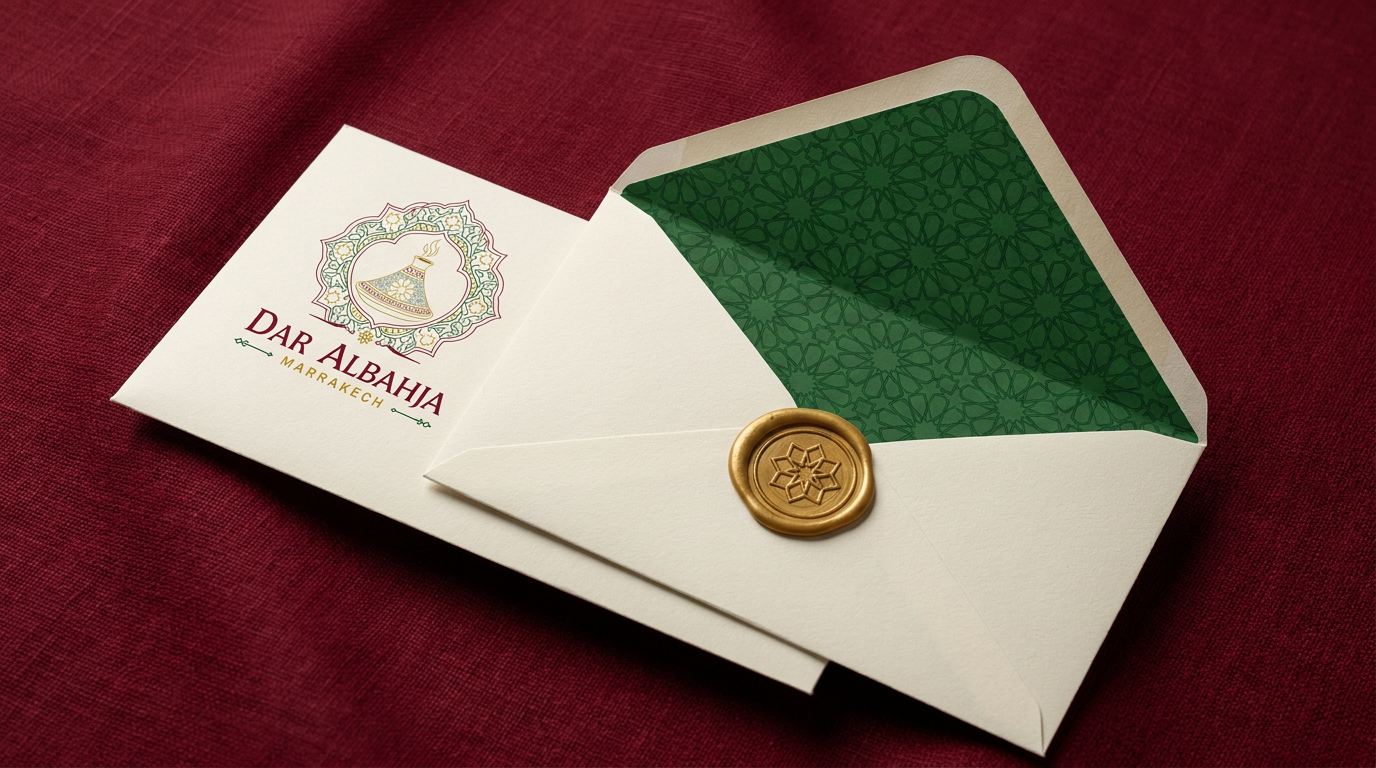 ⌕ ENLARGE
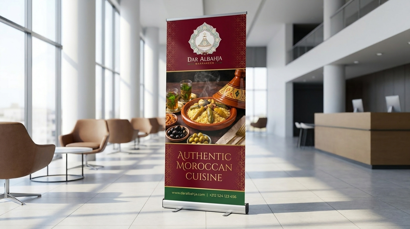 ⌕ ENLARGE
Dar Albahja
Slow-braised lamb, apricot & almonds
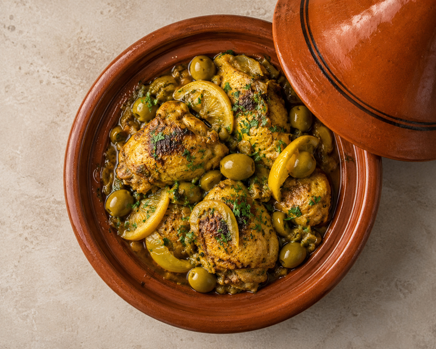
Cinnamon-sugar filo, almond & saffron
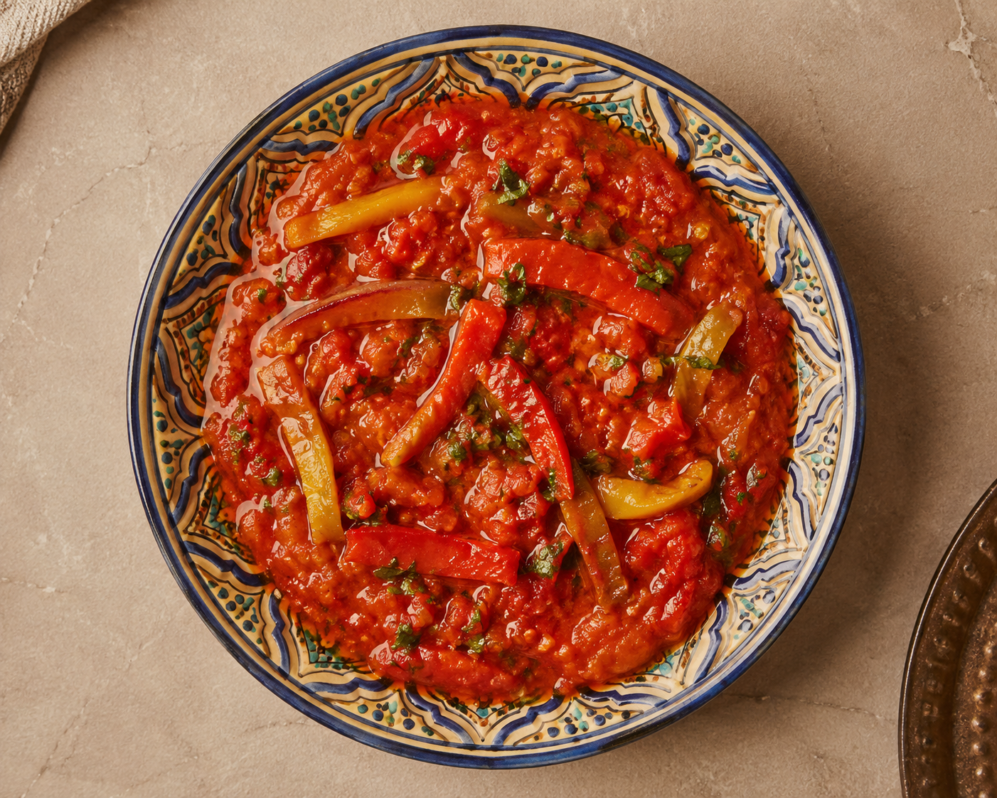
Fresh mint pour, sesame-honey pastry
“The lamb tagine tastes exactly like my grandmother's in Marrakech. Unforgettable.”
“Beautiful branding, beautiful food. The whole experience feels like a riad.”
Free delivery on orders above AED 100 · at your door in 35 minutes
Ten signature dishes · ready in 35 minutes
Slow-braised lamb, apricot & almonds
Cinnamon-sugar filo, almond & saffron
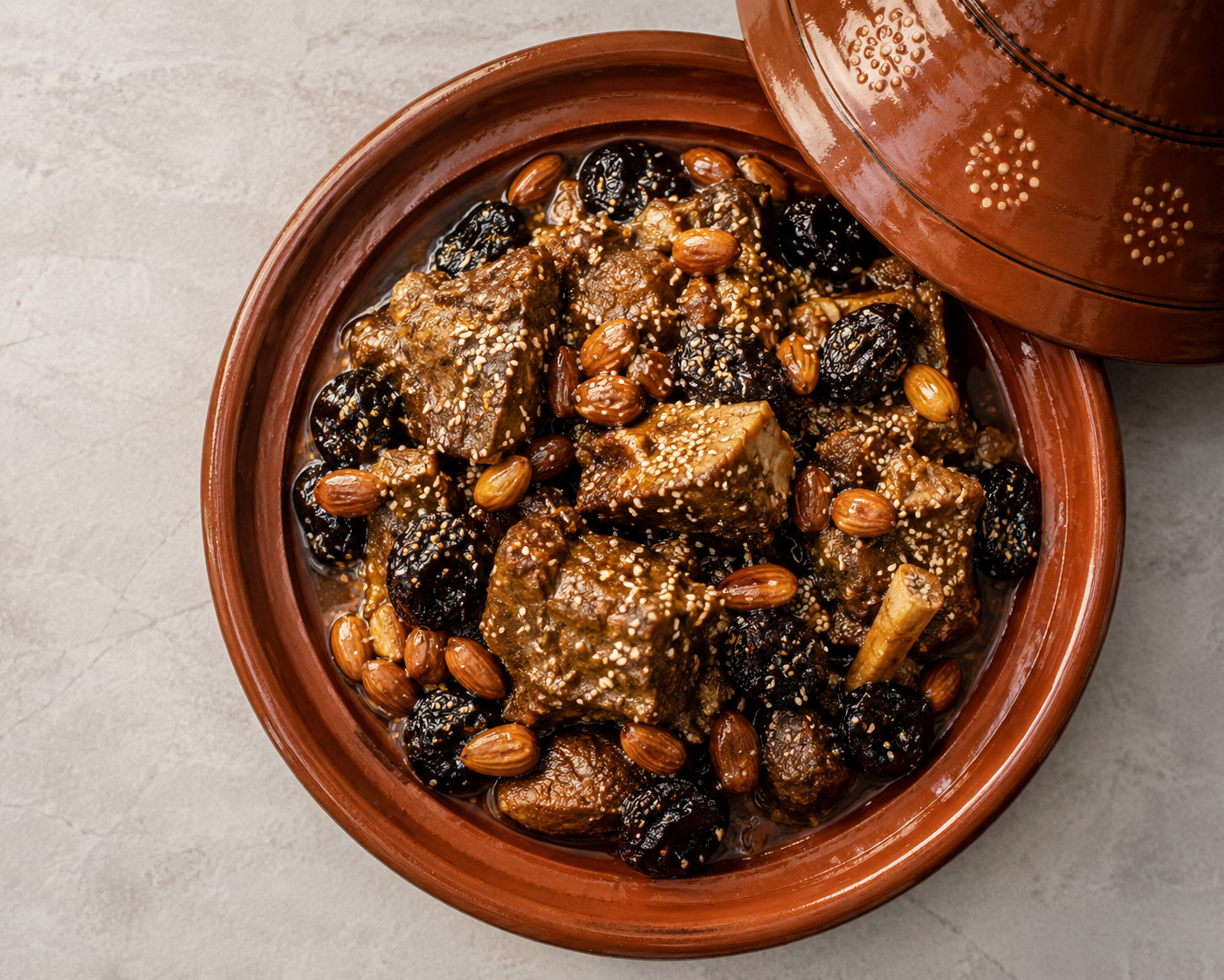
Steamed semolina, garden vegetables
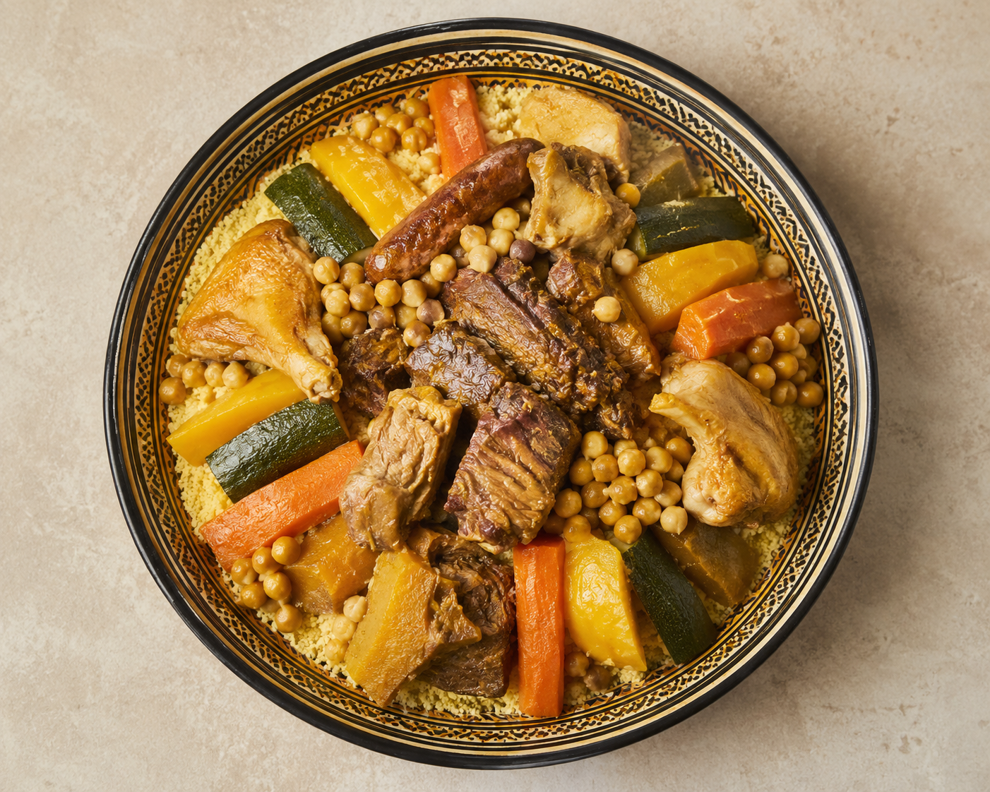
Slow-roasted, cumin salt on the side
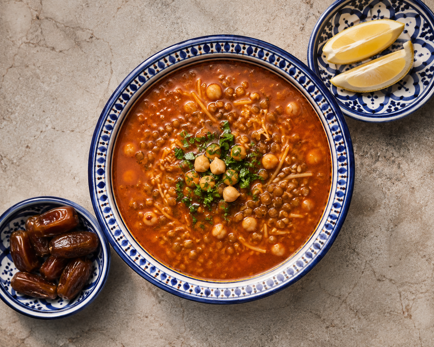
Tomato, lentil & herb, Marrakech style
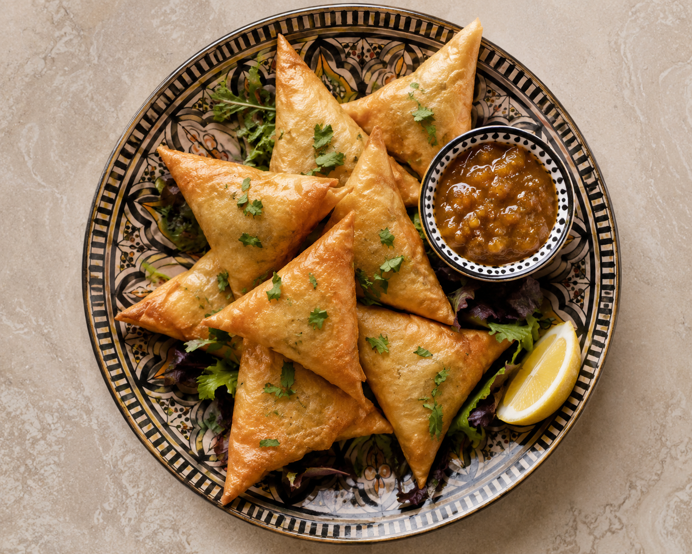
Smoked aubergine dip, warm flatbread
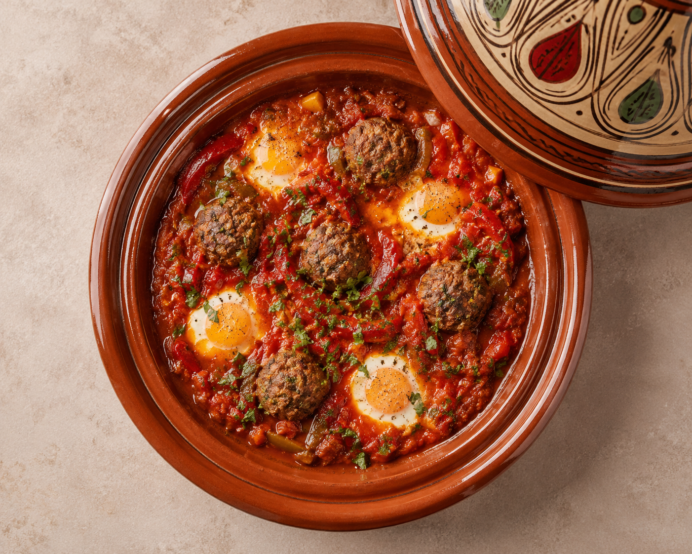
Charcoal-grilled, cumin & parsley
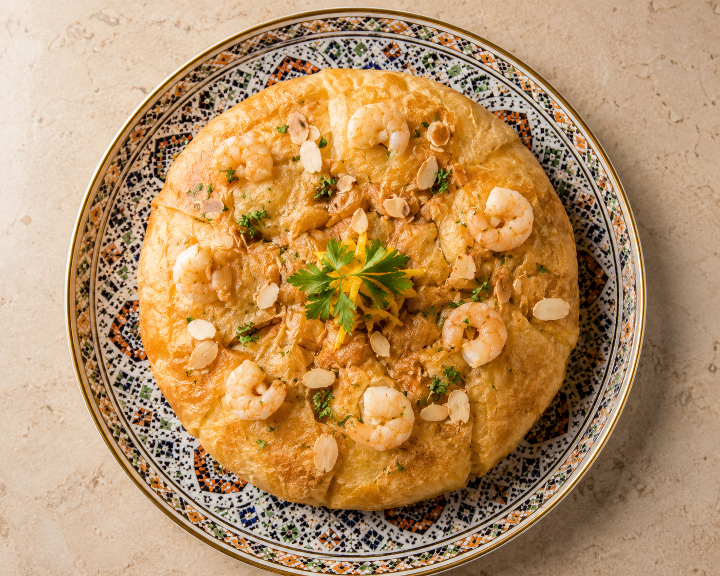
Prawn & fish, saffron cream filo
Layered griddle bread, wild honey
Fresh mint pour, sesame-honey pastry
#DA-2481 · Arriving in 35 min
From a dar in Marrakech to your table · قصتنا
Dar Albahja means “the house of joy” — and that is exactly what we set out to build. Our recipes come from the family kitchens of Marrakech: tagines that simmer for hours over low fires, pastilla folded by hand, mint tea poured high the way tradition demands.
Every plate carries the geometry of the medina — the zellige tiles, the ogee arches, the eight-point stars — because for us, food and craft are one hospitality. Ahlan wa sahlan; the door of joy is open.
Real words from our tables · آراء ضيوفنا
“The lamb tagine tastes exactly like my grandmother's in Marrakech. Unforgettable.”
“Beautiful branding, beautiful food. The whole experience feels like stepping into a riad.”
“Ordered for a family gathering — the packaging alone made everyone smile before the food did.”
“Harira just like Ramadan evenings back home. Delivery was quick and still steaming hot.”
“The mint tea and chebakia ended our dinner perfectly. A little ceremony in a box.”
“Finally, real Moroccan food in Dubai that doesn't cut corners. The pastilla is a must.”
Join 1,200+ happy guests · free delivery above AED 100
We answer faster than the kettle boils · تواصل معنا
You began this presentation with a sealed logo — and assembled it with your own hands. Now it is ready to open its doors.
Enter the access key to download the full PDF
أدخل رمز الدخول لتحميل الملف